How to Make Image Banners & Slideshows Responsive in Shopify Dawn Theme (Simplest Fix for Any Theme)
May 17, 2025
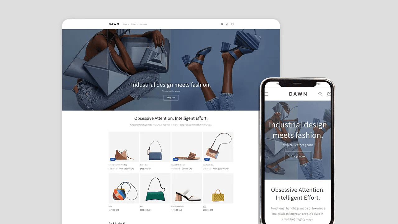
he Dawn theme provides image height options like “Adapt to image,” “Medium,” and “Large” for banners and slideshows. However, it doesn’t fully solve responsiveness across different screen sizes.
The Problem
Desktop: Typically uses wide, horizontal banners.
Mobile: Needs vertical or square images.
Since Dawn doesn’t have a built-in setting to swap images, your slideshow images may get cropped or appear too small to fit the screen width.
A Simple & Brutal Fix
When I looked into the theme code, I realized adjusting image sizes was too complex. Instead of changing too much code, I took a simpler, scalable approach:
Add a responsive setting
Apply basic CSS rules
It’s not the best solution, but it’s clean, reusable, and easy to manage — perfect for multiple Shopify projects.
Step 1: Add a Responsive Setting
Add this to the section schema inside image_banner.liquid or slideshow.liquid
{
  "type": "select",
  "id": "responsive_settings",
  "options": [
    {
      "value": "both",
      "label": "Show on Desktop and Mobile"
    },
    {
      "value": "hide_mobile",
      "label": "Hide on Mobile"
    },
    {
      "value": "hide_desktop",
      "label": "Hide on Desktop"
    }
  ],
  "default": "both",
  "label": "Responsive Settings"
}
Step 2: Apply the Setting to Hide Elements
Add This CSS to Your Liquid File
{%- if section.settings.responsive_settings == 'hide_mobile' -%}
  <style>
    @media screen and (max-width: 750px) {
      #Slideshow-component-{{ section.id }} {
        display: none;
      }
    }
  </style>
{%- endif -%}

{%- if section.settings.responsive_settings == 'hide_desktop' -%}
  <style>
    @media screen and (min-width: 750px) {
      #Slideshow-component-{{ section.id }} {
        display: none;
      }
    }
  </style>
Step 3: Use Two Sections for Desktop & Mobile
Now, instead of forcing one image to fit all screen sizes, I created two separate sections:
Image Banner 1 → Hide on mobile → This is a horizontal desktop image
Image Banner 2 → Hide on desktop → This is a vertical or square mobile image
Final Thoughts
This way, each device gets an optimized image without cropping or distortion.
This isn’t a “perfect” solution — some might argue it’s not the cleanest approach. But for real-world Shopify projects where you need something quick, scalable, and easy to manage, this works really well.
It keeps the original theme logic untouched, avoids messy customizations, and can be easily reused across multiple stores.
💡 Simple. Effective. Scalable.
Give it a try and let me know if you find a better way! 🚀